Kurbo
Kurbo is company focused on providing healthy coaching options for kids and teens. Users can create a goal in the app and can track their daily and weekly progress towards that goal.
What I Did
Re-designed the ongoing usage experience using gamification and gameful design, as well as helped with designing the onboarding information architecture.
Results
Incentivized users to input their food, exercise, height, and weight data daily. Increased and retained user engagement, and provided users immediate and relevant feedback.
Role |
Ongoing Experience and Information Architecture Designer (Team of 2) |
For |
San Jose State University and Kurbo Academic Collaboration |
Date |
Nov 2017 – Dec 2017 |
Type |
Mobile Interactive Prototype |
Methods |
Gamification and Gameful Design Methodologies, Information Architecture, Experience Flows, Wireframing, Axure Prototyping, Object/Action/Attribute Grammar, Grid Design, and Persona Creation |
Tools |
Kurbo Mobile App, Paper Prototyping, Axure RP |
Project Link |
3tvc47.axshare.com/#p=world&c=1 |

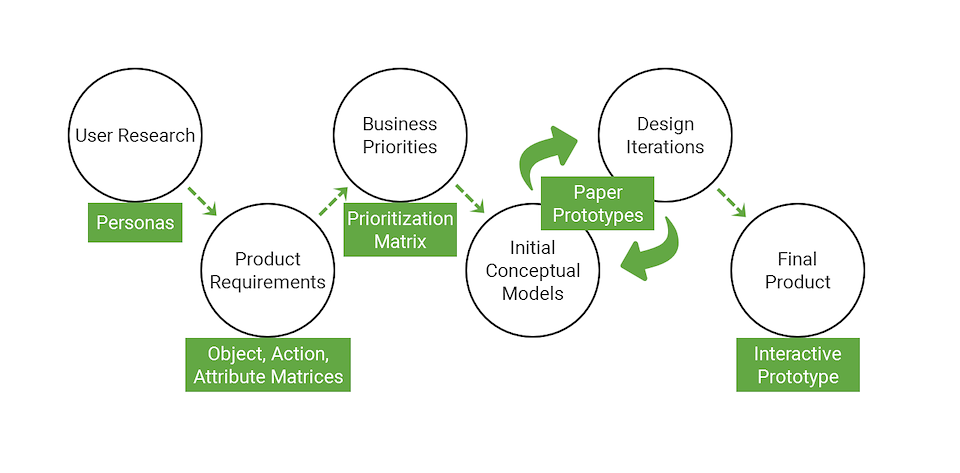

The problem my team was trying to solve in this project was this: How do I redesign Kurbo’s ongoing usage model to increase and retain engagement? The goals of the redesign were to:
Incentivize users to input their food, exercise, height, and weight data daily.
Use gamification and gameful design methodologies to increase and retain user engagement over many months.
Provide the users immediate and relevant feedback on what they have done so far, and what they need to do to reach their health goals.

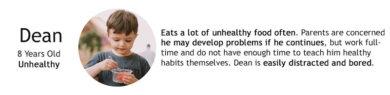
One persona was created based off of the minimum viable scope of the project. Design considerations were made to meet the primary user’s needs and goals.

Object/Action Matrix
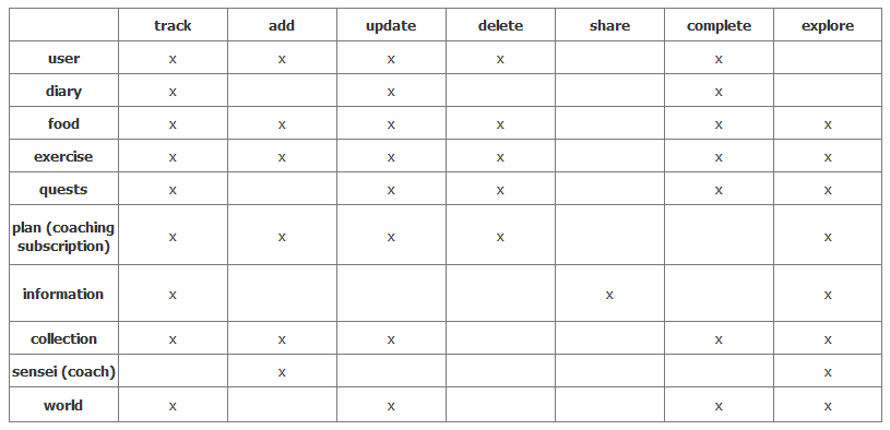
User stories were analyzed from the persona and our own interactions with the app, and the grammar used when reporting the stories were broken down into common objects and actions users will want to take.
Common objects and actions were combined into an object/action matrix and simplified.
Attributes Matrix
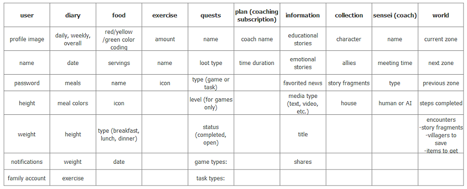
Attributes of each object were synthesized from user stories of the persona and our own experiences based off of what attributes users would expect to find under each object.
Prioritization Matrix
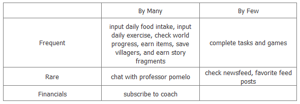
Looking at user goals and what the business wants users to interact with most often, a prioritization matrix was created to organize the objects and actions by where they want frequency of use and by who would use these objects or actions.
Paper Sketches
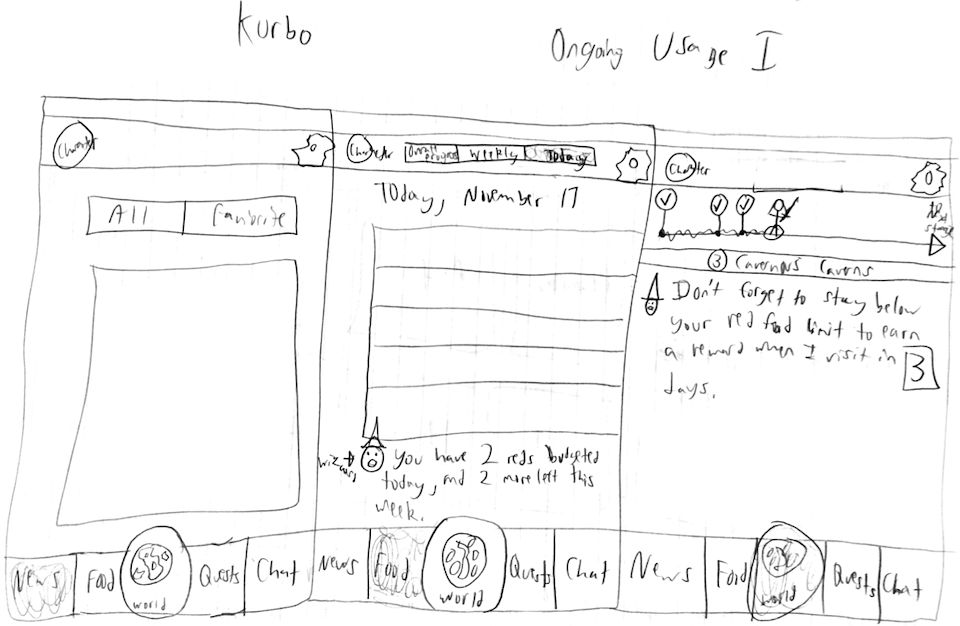
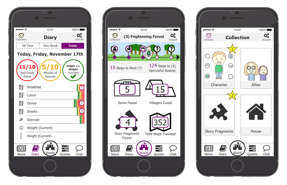
(Left: News)(Center: Food)(Right: World)
This sketch shows the initial design concepts for the News, Food, and World sections of the app.
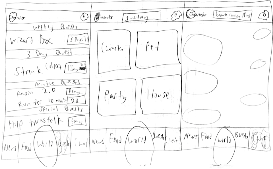
(Left: Quests)(Center: Character)(Right: Chat)
This sketch shows the initial design concepts for the Quests, Character, and Chat sections of the app.

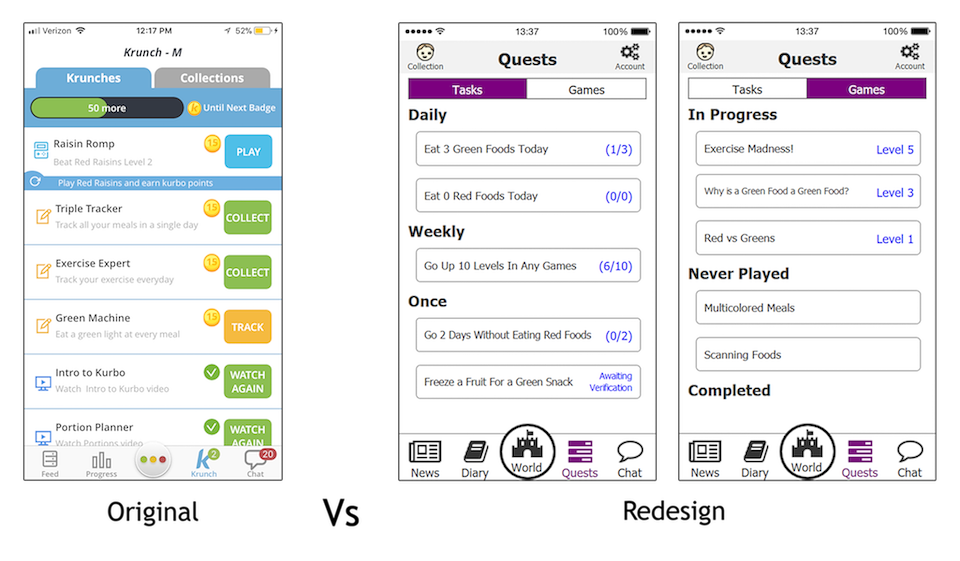
Originally the Kurbo app had the Krunch section of the app as a place for the games, tasks, and collection of the user. The major redesigns were:
1. A greater focus is placed on playing games to learn about eating healthier or exercising.
- Tasks are auto-tracked rather than manually to reduce steps.
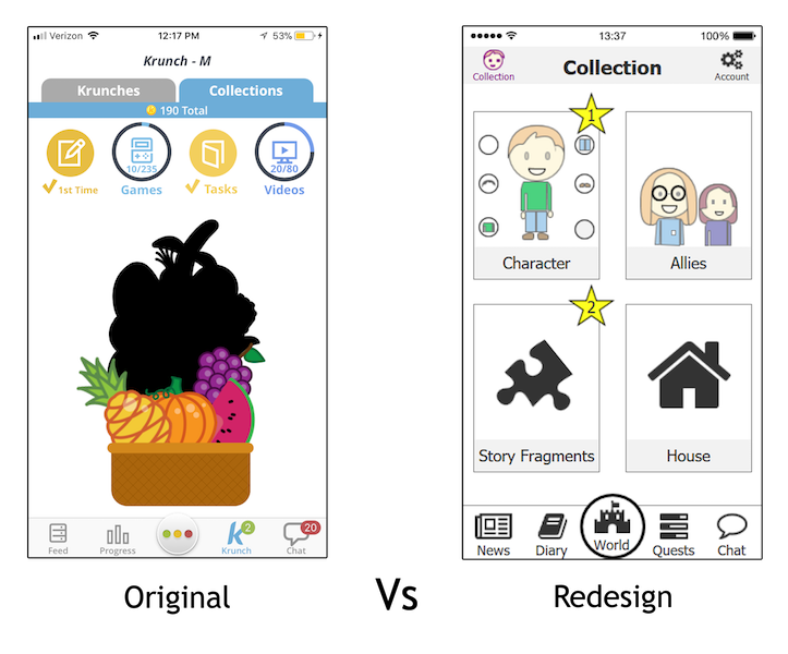
The Collections section was originally where the fruit and coins the user earned through tasks and games would go. In the redesign:
1. Many different types of items with different ways of acquiring them were added instead, creating a deeper engagement loop that lasted much longer.
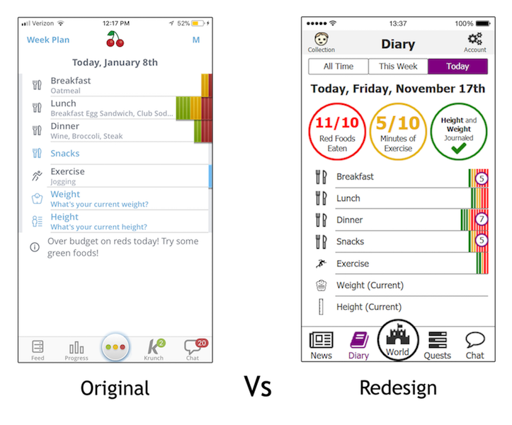
The Stoplight section was originally where the user went to input their daily food, exercise, height, and weight. In the redesign:
1. The circles change from red to yellow to green depending on how the user is doing.

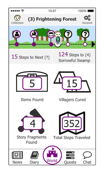
The World section was added as a hub for the gamification and gameful design of Kurbo. It is here the player tracks all of their in-game statistics and can see their progress as well as what they need to do to get to the next point of engagement in the game.